
Learn how to create Shadow effect in Materialize CSS
Google’s Material Design is trending among the designers and many have started using Material Design Concepts in their Websites and Web Applications. On the wake of this, Materialize CSS which we have discussed in our previous tutorials has introduced the Shadow Effect. Shadow can be easily utilized in the project by adding a class in the respective HTML element.
Adding the class=”z-depth-1″ will produce a shadow effect in the respective HTML element. Materialize CSS offers various depth ranges which can be utilized. The depth range varies from 1 to 5. The class=”z-depth-1″ will produce a minimal shadow effect and as the depth range increases shadow effect also increases with class=”z-depth-5″ producing a maximum shadow effect. The shadow explanation can be seen in the following image …
Here’s the link to Materialize CSS Hover Class.

The only drawback is the shadow effect produces a default shadow on the element it has been applied. In order to create a creative layout, it is desirable to have some animation for shadows. Materialize CSS offers a new feature called hoverable, which produces a shadow effect when the element with the hoverable class when hovered. This helps in creating beautiful layouts with the shadow effect when hovered.
In order to understand how the shadow effect, you must start with how to start with Materialize CSS. You can read that from the following link …

Once the Materialize CSS project has been created, the next step is to demonstrate how z-depth-1 works, the following code and image will help you understand how the z-depth class works
  <div class="row">
            <div class="col m4 s12 z-depth-1">
                <h1>Header 1</h1>
                <p>Lorem ipsum Dolor Lorem ipsum Dolor Lorem ipsum Dolor Lorem ipsum Dolor Lorem ipsum Dolor</p>
            </div>
            <div class="col m4 offset-m2 s12 z-depth-5">
                <h1>Header 1</h1>
                <p>Lorem ipsum Dolor Lorem ipsum Dolor Lorem ipsum Dolor Lorem ipsum Dolor Lorem ipsum Dolor</p>
            </div>
        </div>
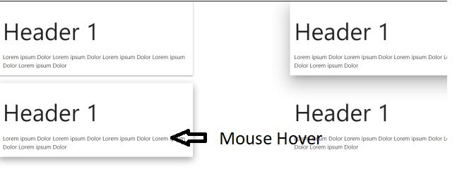
Now we will demonstrate how the hoverable class works. In order, to demonstrate this duplicate the row and instead of z-depth classes replace it with hoverable class. This will create a flat layout, however, when we hover the mouse over the respective columns, it creates a shadow. The coding and image are mentioned below …
<div class="row">
            <div class="col m4 s12 hoverable">
                <h1>Header 1</h1>
                <p>Lorem ipsum Dolor Lorem ipsum Dolor Lorem ipsum Dolor Lorem ipsum Dolor Lorem ipsum Dolor</p>
            </div>
            <div class="col m4 offset-m2 s12 hoverable">
                <h1>Header 1</h1>
                <p>Lorem ipsum Dolor Lorem ipsum Dolor Lorem ipsum Dolor Lorem ipsum Dolor Lorem ipsum Dolor</p>
            </div>
        </div>
You can also learn how to have Sidenav as main nav in Materialize CSS