
Learn how to add Sidenav as main navigation
In the web designing, the majority of the navigation which is used either for a web application or for the websites is the Top Navigation System. Materialize CSS offer varieties of variation for Topbar Navigation System. We at Ampersand Tutorials have deep dived on various Top Navigation Bar if you would like to learn more about it, you can follow the links given below.
In general, Navigation bar serves as a guide to a website or a web application. In this tutorial, we will demonstrate how to incorporate a fixed side-navigation for a website or a web application. In order to achieve it, first, you should learn to start with the Materialize CSS project, which you can read from the following link.
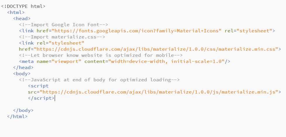
The second step is to visit the Materialize CSS official website and copy-paste the latest CDN version which is 1.0.0. Please note that we have imported CDN in this demo and we haven’t used JQuery, instead we have used JS. Once you have successfully set up the Materialize CSS project, the coding looks like the following image.
After which, we must visit the Sidenav page in Materialize CSS website, the link is given below
https://materializecss.com/sidenav.html
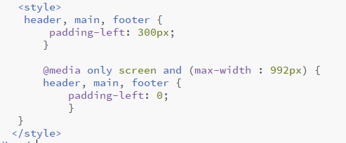
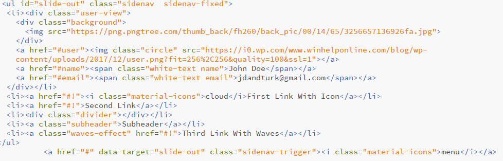
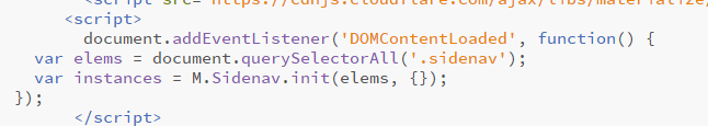
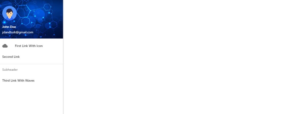
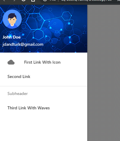
From the aforementioned link, we must now scroll down and find the section fixed HTML structure and we should copy-paste the HTML, CSS and JS coding to our project. The following screenshots are examples of how the structure will look after the successful implementation of Fixed Side Nav Coding. In the demo, we have used a slightly different HTML script to bring the desired output. The CSS is used to make the fixed sidenav disappear and make it mobile triggered navigation system. The JS part helps in initializing the Side Nav. You can view and download this working code from the link given at the bottom of this article.
header, main, footer {
             padding-left: 300px;
            }

            @media only screen and (max-width : 992px) {
            header, main, footer {
                padding-left: 0;
                }
        }
<ul id="slide-out" class="sidenav sidenav-fixed">
<li><div class="user-view">
<div class="background">
<img src="https://png.pngtree.com/thumb_back/fh260/back_pic/00/14/65/3256657136926fa.jpg">
</div>
<a href="#user"><img class="circle" src="https://i0.wp.com/www.winhelponline.com/blog/wp-content/uploads/2017/12/user.png?fit=256%2C256&quality=100&ssl=1"></a>
<a href="#name"><span class="white-text name">John Doe</span></a>
<a href="#email"><span class="white-text email">jdandturk@gmail.com</span></a>
</div></li>
<li><a href="#!"><i class="material-icons">cloud</i>First Link With Icon</a></li>
<li><a href="#!">Second Link</a></li>
<li><div class="divider"></div></li>
<li><a class="subheader">Subheader</a></li>
<li><a class="waves-effect" href="#!">Third Link With Waves</a></li>
</ul>
<a href="#" data-target="slide-out" class="sidenav-trigger"><i class="material-icons">menu</i></a>
document.addEventListener('DOMContentLoaded', function() {
    var elems = document.querySelectorAll('.sidenav');
    var instances = M.Sidenav.init(elems, {});
  });
Learn about Autoplay Sliders in Materialize CSS