
Learn How to increase sidenav width in materialize css
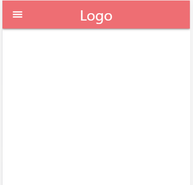
Side Navigation, by default, is designed to appear on the smaller screen which will be triggered by a navigation button. Mobile Collapsible Side Navigation can be configured from Materialize CSS website. You can check the code from the following link
https://materializecss.com/navbar.html
Once you have added the necessary HTML, CSS and JS for Mobile collapsible menu, you will be getting the following output. On the contrary, if you would like to know how to create sidenav, please follow the link below …


After you have incorporated the mobile navigation, you will be able to find that the default side nav size is approx 300px. The following screenshots will help you understand the width of the side nav.
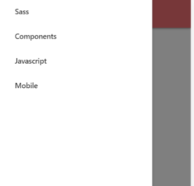
Furthermore, if we have longer content or shorter content the default width size will generate a poor UI with improper width size. This can be rectified using a simple CSS to either increase or decrease the sidenav width.
The side nav CSS has to be written for the ul with the id=”mobile-demo”.
