
Quick answer: A Materialize CSS card animation starts with the card class and its wrapper, then adds motion. Use the hoverable class for a lift on hover, or write your own CSS transition on transform and box-shadow, since Materialize supplies the card styling but not the animation itself.
Table of Contents
Learn Materialize Card Animation and implement in your projects
Materialize Card Animation – Introduction:
Materialize CSS Framework provides several card layouts which include Simple Card, Card with Image, Card with Action, Horizontal Cards, etc. There are several instances where web developers require card animation. For example, when a mouse hovers on a card, it should rotate and reveal the new card. There is no default option in Materialize CSS Framework to animate a card, this tutorial/plugin will enable the web developers to animate a card, i.e., on hovering over the card it will rotate 360 degrees horizontally and will display a new card with different information on it. Let’s get started.
Step 1
Create a dummy Materialize CSS framework template from the Materialize CSS website. You can either use CDN method or download the respective CSS and JS file from the website. In this tutorial, we have utilized CDN, alternatively, you can download the files and add the CSS and JS links in the HTML file.
http://materializecss.com/getting-started.html
Step 2
After creating the dummy Materialize CSS template, add the Materialize CSS card from the Materialize CSS website. In the tutorial, we have opted the Simple Materialize CSS card. Note that in the tutorial we have changed the color of the card and text on the card. However, these attributes can be changed according to the requirement. Furthermore, we have fixed the width of the card to M4 for the demo, even this can be changed according to the requirement.
<div class="row">
<div class="col s12">
<div class="card white">
<div class="card-content black-text">
<span class="card-title">Card Title</span>
<p>
I am a very simple card. I am good at containing small bits of information.I am convenient because I require little markup to use effectively.
</p>
</div>
<div class="card-action">
<a href="#" class="black-text">This is a link</a>
</div>
</div>
</div>
</div>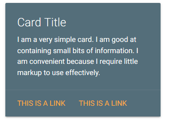
Step 3
Once we have added the Simple Card, we can now add the functionality for hover to rotate the card. Basically, the functionality here is to rotate the card to reveal a new card when hovered over the inserted card. In order to achieve this Materialize Card Animation, we will be leveraging several CSS properties such as Transform, Perspective, Transform Style, Transition, Z-Index. The respective CSS and HTML script are given. We have differentiated the Front View Card and Back View Card with the classes Front and Back. Ideally, the card inside the Front class is the default card and the card inside the Back class is the card with will appear on hover.
CSS Properties to be added
/* entire container, keeps perspective */
                .flip-container {
                    perspective: 1000px;
                }
                    /* flip the pane when hovered */
                .flip-container:hover .flipper, .flip-container.hover .flipper {
                        transform: rotateY(180deg);
                    }
                .flip-container, .front, .back {
                    width: 300px;
                    height: 480px;
                }
                /* flip speed goes here */
                .flipper {
                    transition: 0.6s;
                    transform-style: preserve-3d;
                    position: relative;
                }
                /* hide back of pane during swap */
                .front, .back {
                    backface-visibility: hidden;
                    position: absolute;
                    top: 0;
                    left: 0;
                }
                /* front pane, placed above back */
                .front {
                    z-index: 2;
                    /* for firefox 31 */
                    transform: rotateY(0deg);
                }
                /* back, initially hidden pane */
                .back {
                    transform: rotateY(180deg);
                }
HTML Code
<div class="row">
      <div class="col m4 offset-m4 s12">
    <div class="flip-container" ontouchstart="this.classList.toggle('hover');">
	<div class="flipper">
            <div class="front">
              <div class="row">
                <div class="col s12 m12">
                      <div class="card black darken-1">
                        <div class="card-content white-text">
                          <span class="card-title">Card Title</span>
                          <p>I am a very simple card. I am good at containing small bits of information.
                          I am convenient because I require little markup to use effectively.</p>
                        </div>
                        <div class="card-action">
                          <a href="#" class="white-text">This is a link</a>
                        </div>
                      </div>
                </div>
                </div>
            </div>
        <div class="back">
              <div class="row">
                <div class="col s12">
                  <div class="card white">
                    <div class="card-content black-text">
                      <span class="card-title">Card Title</span>
                      <p>I am a very simple card. I am good at containing small bits of information.
                      I am convenient because I require little markup to use effectively.</p>
                    </div>
                     <div class="card-action">
                          <a href="#" class="black-text">This is a link</a>
                     </div>
                  </div>
                </div>
              </div>
        </div>
	</div>
</div>
          </div>
</div>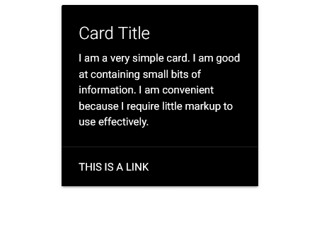
Learn about Materialize CSS Nested Dropdown
Part of the Materialize CSS Mastery series: start with the complete Materialize CSS tutorial for the full course.
Frequently asked questions
Does Materialize CSS animate cards automatically?
Only partially. The hoverable class lifts a card on hover, while real animation on load or scroll requires your own CSS keyframes.
What is the difference between a card and a card panel in Materialize?
A card-panel wraps a plain block with the standard elevation and rounded corners, while a card holds structured content like images, titles and actions.
How do I make Materialize cards fade in as the page loads?
Give each card a custom animation class, set opacity to zero, then trigger it with a CSS animation or a small JavaScript timeout after the page loads.
Last updated on · Written by Dinesh Kumar R