Learn to implement Full width autoplay slider for Materialize CSS
It is a known fact that Materialize CSS offers in-built carousel for fullscreen and full-width image sliders. However, many designers feel that the carousel seems to malfunction several times, especially when the designers used the fullwidth carousel. One of the predominant comment which we can see is that in the mobile screens, the image slider gets cut off. It is desirable to have full-width image sliders with width 100% rather than having cut off images.
We will demonstrate how the existing Materialize CSS code renders Image sliders in the mobile screens. In order to check this, first, let us copypaste the HTML structure from MaterializeCSS website. The version which we use is 1.0.0.
https://materializecss.com/getting-started.html
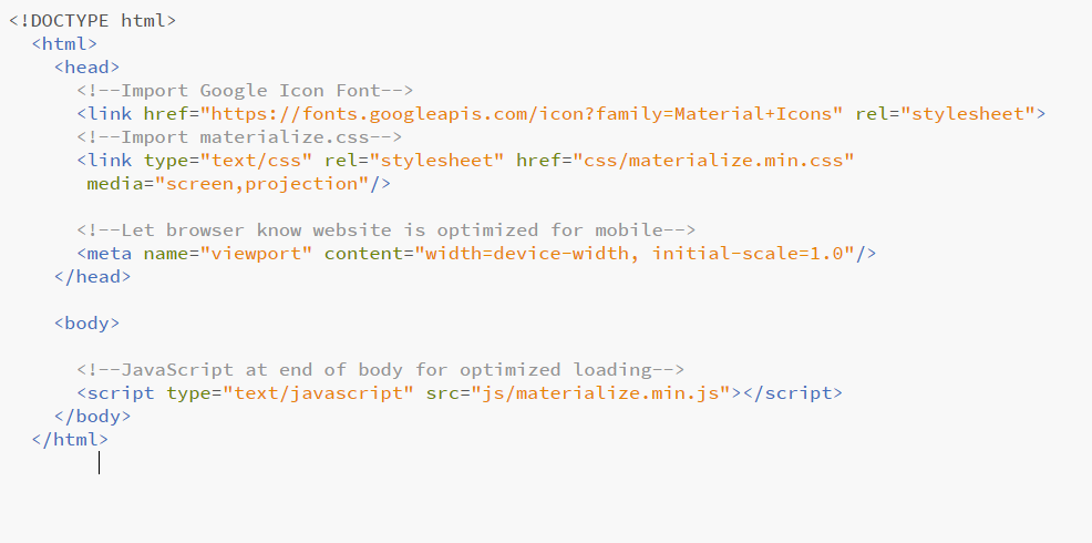
Next step is to navigate to Javascript components section in the Materialize CSS website.
https://materializecss.com/carousel.html
Next, you can scroll down and copy the full-width slider HTML and js script to our project.
The HTML code can be directly pasted in the body, however, the JS should be pasted inside the script tag with the following syntax
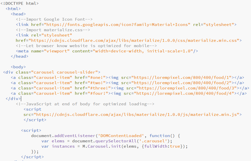
<script>
 document.addEventListener('DOMContentLoaded', function() {

 });
</script>
The full-width slider js has to be copy-pasted inside the curly braces.
var elems = document.querySelectorAll('.carousel');
var instances = M.Carousel.init(elems, {});

Furthermore, to make the slides autoplay is difficult in Materialize CSS. This made us write HTML, CSS and JS to create a mobile responsive slider which auto plays. It is simple to configure this slider in the Materialize CSS. Just copy paste the HTML, CSS and respective JS in your project file. Link the images in the HTML code and you are done.
This not only helps us build mobile responsive slider but also helps in making it autoplay. Following are the respective codes
<style>.mySlides {display:none;}</style><div class="row" style="max-width: 100%">
<img class="mySlides" src="https://lorempixel.com/800/400/food/1" style="width:100%">
<img class="mySlides" src="https://lorempixel.com/800/400/food/2" style="width:100%">
<img class="mySlides" src="https://lorempixel.com/800/400/food/3" style="width:100%">
<img class="mySlides" src="https://lorempixel.com/800/400/food/4" style="width:100%">
</div><script>
var myIndex = 0;
carousel();
function carousel() {
var i;
var x = document.getElementsByClassName("mySlides");
for (i = 0; i < x.length; i++) {
x[i].style.display = "none";
}
myIndex++;
if (myIndex > x.length) {myIndex = 1}
x[myIndex-1].style.display = "block";
setTimeout(carousel, 5000); // Change image every 2 seconds
}
</script>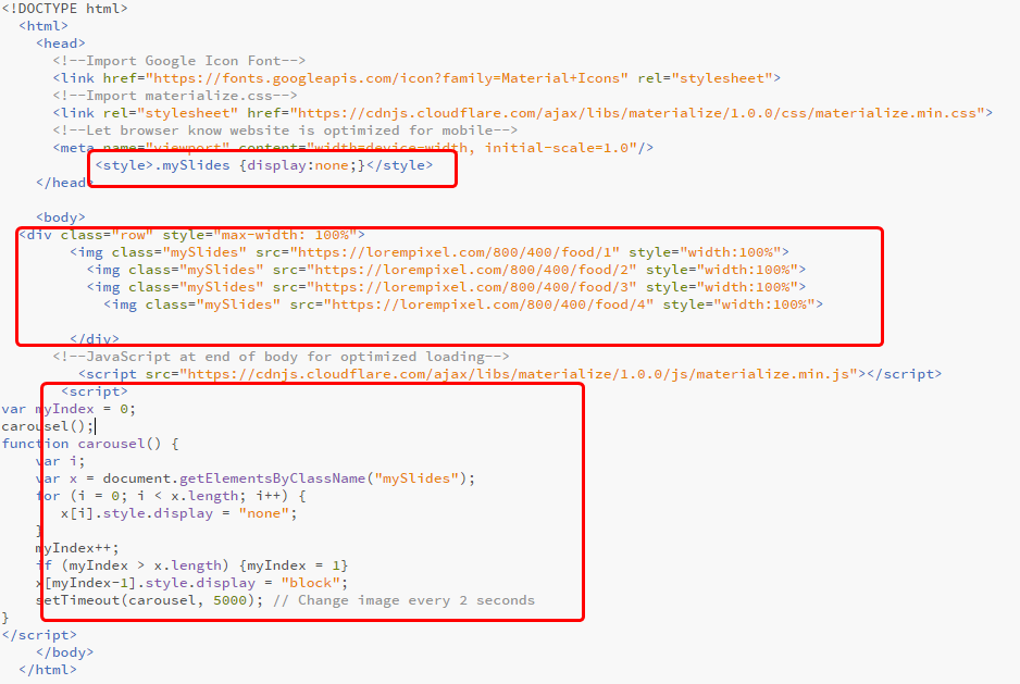
The time interval at which the slides are changed can be adjusted in the JS code. In this example, we have set it to 5 sec.