
Quick answer: CSS animations run a @keyframes sequence on their own, with multiple steps, loops and direction, while a transition animates a property only when its value changes, usually on hover or focus. Animate transform and opacity for smooth performance, keep durations short, and always respect prefers-reduced-motion.
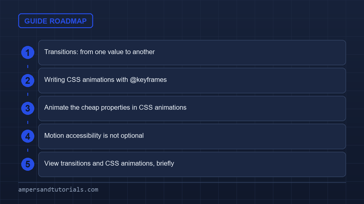
Table of Contents
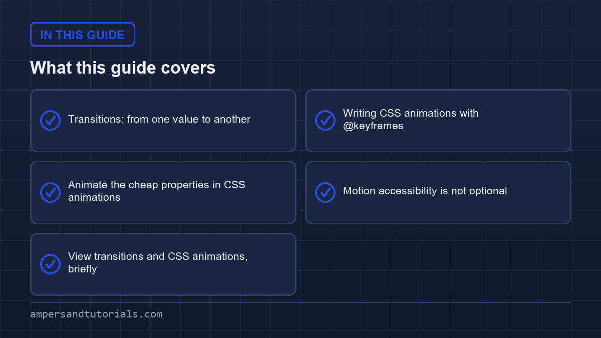
Transitions: from one value to another
A transition needs four things: a start value, an end value triggered by a state, the property to animate, and a duration.
.button {
  background: #0f766e;
  transform: translateY(0);
  transition: background-color 200ms ease, transform 200ms ease;
}
.button:hover {
  background: #115e59;
  transform: translateY(-2px);
}- Duration — 150–300ms for UI feedback. Anything over 500ms feels sluggish.
- Timing function —
ease-outfeels natural for entrances,ease-infor exits. - Property — name the property, or use
allsparingly; naming it avoids animating things you did not intend. - Delay — an optional fourth value, useful for staggering a list.
Writing CSS animations with @keyframes
When you need more than a start and end, or the animation should run without a user action, use @keyframes.
@keyframes fade-up {
  from { opacity: 0; transform: translateY(12px); }
  to   { opacity: 1; transform: translateY(0); }
}

.alert {
  animation: fade-up 300ms ease-out both;
}

.spinner {
  animation: spin 1s linear infinite;
}
@keyframes spin { to { transform: rotate(360deg); } }
The animation shorthand takes name, duration, timing, delay, iteration count and fill mode. The both fill mode is useful: it applies the first keyframe’s values before the animation starts and keeps the last after it ends, so there is no flash of unstyled content.
| Property | Purpose |
|---|---|
animation-iteration-count | 1 or infinite |
animation-direction | normal, reverse, alternate |
animation-play-state | paused to stop on interaction |
animation-fill-mode | both to hold start and end values |
Animate the cheap properties in CSS animations
Performance depends on which properties you animate. transform and opacity are handled by the compositor and do not trigger layout, so they stay smooth even on busy pages. Animating width, height, top or margin forces the browser to recalculate layout on every frame.
/* avoid: triggers layout each frame */
.panel { transition: width 300ms; }

/* prefer: composite-only, no layout */
.panel { transition: transform 300ms; }
.panel.open { transform: scaleX(1); }
Where you need a size change, animating transform: scale() is usually the fast substitute. Check the DevTools Performance panel if a card of yours stutters — it shows exactly which frames triggered layout.
Motion accessibility is not optional
Some people are made ill by large or looping motion. Respect the operating-system setting with one media query that turns animation off for those who ask.
@media (prefers-reduced-motion: reduce) {
  *, *::before, *::after {
    animation-duration: 0.01ms !important;
    animation-iteration-count: 1 !important;
    transition-duration: 0.01ms !important;
    scroll-behavior: auto !important;
  }
}
That block keeps the interface functional while removing the motion. Add it to every project, and test it in your browser’s emulation settings before shipping.
View transitions and CSS animations, briefly
For richer page or state changes, the View Transitions API animates between two DOM states with a single call to document.startViewTransition() and a little CSS. It is a newer capability — widely available for same-document transitions, with less complete support for cross-document ones — so use it as progressive enhancement. When you want a simple hover or entrance, transitions and keyframes above remain the everyday tools.
That completes the CSS series. To learn modern CSS with a mentor on real designs, Ampersand Academy teaches web development one-to-one.
Combining multiple effects with css animations
Building layered visual interactions often requires applying several effects simultaneously to the same interface component. When developers apply multiple css animations to a single element, comma-separated lists declare every timeline clearly. Browser engines evaluate these lists sequentially, matching durations, delays, timing curves, and iteration counts against each named keyframe block. Understanding how these layers interact prevents unexpected visual overrides and maintains predictable render performance across desktop and mobile browsers.
The shorthand syntax accepts multiple comma-separated definitions on the animation property. If one sub-property contains fewer comma-separated values than the animation names list, the CSS engine repeats that values list from the start until lengths match. Explicit definitions remain cleaner and prevent accidental inheritance across shared rulesets. Declaring individual properties like animation-name and animation-duration separately often improves readability across large engineering teams maintaining enterprise component libraries.
Property collisions represent the primary challenge when stacking multiple motion profiles on a single selector. If two separate keyframe sequences manipulate the same visual property, standard cascade rules dictate that the final sequence wins. Historically, developers solved this limitation by nesting multiple div containers, assigning one transform to an outer wrapper and another to an inner card. This workaround cluttered HTML documents with unsemantic structural markup.
Understanding animation composition rules
Modern browsers introduced the animation-composition property to resolve property collisions when stacking dynamic transformations on a single target. Traditional css animations default to the replace behavior, where the last declared keyframe rule completely overwrites values established earlier in the cascade or by prior running animations. This legacy behavior often breaks modular design systems where base positioning, floating ambient effects, and user-triggered shake sequences need to run concurrently on one element.
Setting animation-composition: add instructs the browser rendering engine to combine transformed values instead of overwriting them. A translation applied by an idle floating effect will add its spatial coordinates directly to an active shake sequence. The accumulate value goes one step further by mathematically merging compatible numeric metrics, providing seamless blending for complex graphic interfaces without triggering layout recalculations or demanding nested wrapper elements across your document tree.
.badge-pulse {
  animation: float 3s ease-in-out infinite, pulse 1.5s ease-in-out infinite;
  animation-composition: add;
}

@keyframes float {
  to { transform: translateY(-8px); }
}

@keyframes pulse {
  to { transform: scale(1.05); }
}
.badge-pulse {
animation: float 3s ease-in-out infinite, pulse 1.5s ease-in-out infinite;
animation-composition: add;
}@keyframes float {
to { transform: translateY(-8px); }
}@keyframes pulse {
to { transform: scale(1.05); }
}
Utilizing composite transforms allows interface elements to handle persistent environmental motion alongside responsive user feedback loops. Modular css animations defined this way eliminate the need for nested wrapper elements previously required to separate translation, rotation, and scaling coordinates. Maintaining a single DOM node reduces memory consumption in high-density views such as data tables, interactive dashboards, or gaming canvases that render hundreds of simultaneous animated markers on screen.
Scroll-driven timelines in modern layouts
Modern layout engines now support declarative scroll-linked behavior natively through the Scroll-driven Animations specification. Historically, binding playback to document scrolling demanded JavaScript scroll event listeners or Intersection Observer loops that frequently risked layout thrashing and dropped frames. Authoring scroll-linked css animations inside stylesheet declarations offloads position calculations entirely to compositor threads, preserving smooth sixty-frame-per-second refresh rates across heavy viewports without executing a single line of client script during scroll operations.
The animation-timeline property links a keyframe sequence directly to an ancestor scroll container instead of relying on real-time wall-clock durations. Developers define scroll progress using the scroll() functional notation or assign named timelines via the scroll-timeline-name property on scrolling ancestors. When tied to scroll progress, traditional duration values become relative percentage markers along the defined travel distance, converting physical scrolling gestures directly into timeline progression.
Progress indicators using scroll timelines
Progress bars along article headers represent the most practical implementation of scroll-linked movement. By binding scale transformations to viewport movement, reading progress updates synchronously without incurring continuous script evaluation overhead. Traditional implementations required throttling scroll events and calculating scroll height ratios in JavaScript, which often lagged behind touch displays. Pure CSS implementations handle gestures natively, synchronizing rendering tasks with hardware refresh cycles automatically and providing zero-latency visual feedback.
@keyframes reading-progress {
  from { transform: scaleX(0); }
  to { transform: scaleX(1); }
}

.reading-bar {
  position: fixed;
  top: 0;
  left: 0;
  width: 100%;
  height: 4px;
  transform-origin: left;
  animation: reading-progress linear;
  animation-timeline: scroll(y root);
}
@keyframes reading-progress {
from { transform: scaleX(0); }
to { transform: scaleX(1); }
}.reading-bar {
position: fixed;
top: 0;
left: 0;
width: 100%;
height: 4px;
transform-origin: left;
animation: reading-progress linear;
animation-timeline: scroll(y root);
}
The view() timeline function provides localized scrolling triggers relative to element visibility inside scrollport bounds. Instead of tracking entire document scroll lengths, elements reveal or dismiss themselves based on scroll margins and intersection thresholds. Applying scroll-driven css animations to editorial cards creates fluid entrance sequences that match user thumb velocity precisely without external library dependencies, improving initial page weight and eliminating layout shifts common with dynamic script injection.
Browser compatibility for scroll timelines requires careful fallback management across legacy devices. Standard fallbacks ensure static layouts remain fully legible if timeline functions fail to parse in older browsers. Progressively enhancing layouts with native scroll-driven css animations delivers top-tier performance on modern engines while preserving baseline utility for legacy browsing clients. Using @supports (animation-timeline: scroll()) guarantees that unsupported browsers gracefully skip timeline properties without showing partially broken states.
Controlling playback and events with JavaScript
Even purely declarative stylesheets often require coordination with application business logic. User interactions like saving forms, closing modal dialogs, or handling network timeouts must synchronize with running motion curves. Controlling native css animations via the Document Object Model provides robust hooks for orchestrating state transitions cleanly. Modern browser APIs expose read and write access to running timelines, bridging the gap between static style sheets and reactive client-side applications.
Pausing running sequences dynamically relies on the animation-play-state CSS property. Toggling this property between running and paused via utility classes or direct script access halts interpolation instantaneously without resetting the internal playhead. Resuming playback continues the sequence from that exact fractional frame, ensuring zero visual disruption for end users. This technique forms the foundation for accessible media controls, interactive product tours, and canvas-based game pauses.
Listening for animation lifecycle signals
Browser engines emit four dedicated DOM events throughout keyframe lifecycles: animationstart, animationiteration, animationend, and animationcancel. Listening for these signals enables precise sequencing, such as removing temporary DOM nodes only after exit sequences complete. Inspecting the animationName and elapsedTime properties on received event objects guarantees accurate identification when multiple css animations attach to one node, preventing early removals or orphaned elements when complex composite sequences execute concurrently.
Common lifecycle event workflows include the following practical implementation patterns:
- Removing dismissed toast notifications from document trees immediately after exit sequences fire
animationend. - Triggering network analytics beacons when promotional banners complete their primary display iterations.
- Disabling interactive form submission buttons while processing spinners execute initial entrance phases.
- Synchronizing sound effects with looped iteration boundaries using
animationiterationevent payloads.
Restarting a keyframe sequence programmatically represents a frequent development hurdle. Modifying class lists synchronously often fails because browser style calculations batch DOM updates to minimize layout thrashing. Forcing a reflow via void element.offsetWidth between class removals and additions forces the engine to recalculate geometry, allowing developers to restart active css animations reliably on demand without introducing asynchronous timer hacks or unpredictable requestAnimationFrame delays into production codebases.
Debugging performance traps in css animations
While offloading movement to hardware-accelerated compositor layers delivers silky frame delivery, subtle authoring mistakes introduce severe stutter. Developers routinely encounter frame drops when unintentionally animating properties that invalidate layout geometry or trigger expensive repaints. Isolating performance traps within production css animations demands structured inspection techniques using modern browser developer tools. Recognizing which CSS properties trigger expensive engine recalculations ensures that motion remains smooth even on constrained mobile hardware.
Animating box shadows, filter effects, or border radii frequently forces continuous rasterization on the main browser thread. Even though these visual modifications avoid recomputing document box layouts, they mandate expensive layer repaints on every animation tick. When deploying high-framerate css animations, substitute multi-stop box shadows with pseudo-elements running pre-rendered opacity fades to preserve compositor velocity, reducing battery drain and eliminating dropped frames during rapid user scrolling on handheld devices.
Overusing the will-change property represents another critical pitfall. Marking dozens of DOM nodes with will-change: transform instructs the graphics engine to allocate dedicated GPU backing stores for each node prematurely. This excessive allocation consumes physical device memory rapidly, triggering browser tab crashes on low-powered mobile hardware. Apply will-change strictly before motion begins and remove it upon completion, or let the browser manage layer creation automatically whenever possible.
Key steps for diagnosing dropped frames in development environments include:
- Open DevTools and inspect running keyframe blocks inside the dedicated Animations drawer.
- Slow playback speed to 10% to visually inspect timing anomalies and jumpy transition jumps.
- Enable Paint Flashing under rendering settings to identify unneeded repainting zones across viewports.
- Record a CPU profile to verify that script execution stays quiet while css animations cycle.
Background tabs also require resource conservation. Modern browsers throttle or freeze JavaScript timers in background tabs, but infinite CSS keyframe loops can still consume battery power if tied to elements triggering software compositing. Pausing background activity safeguards battery longevity across mobile user segments. Implementing an Intersection Observer or Page Visibility API handler to pause non-essential ambient motion when components leave viewports preserves device resources effectively.
Discrete property interpolation and starting style
Animating transitions to and from display: none historically required fragile JavaScript timeouts or nested class transitions. The modern CSS specification resolves this limitation by introducing discrete property interpolation alongside the @starting-style rule. These additions allow native css animations to transition non-continuous properties like display and overlay smoothly during modal dialog openings and dismissals, eliminating the jarring snap that previously plagued popover components and accessible disclosure widgets.
Discrete properties jump immediately between binary states rather than interpolating along fractional numbers. By specifying transition-behavior: allow-discrete, developers enable transitions for discrete properties when entering or leaving the visible document tree. Combining this capability with declarative css animations yields clean popovers, dialog backdrops, and navigation trays that animate gracefully without third-party utility scripts, providing full visual continuity while maintaining accessible focus management and keyboard navigation boundaries.
dialog[open] {
  opacity: 1;
  transform: scale(1);
  transition: opacity 250ms ease, transform 250ms ease, display 250ms allow-discrete;
}

@starting-style {
  dialog[open] {
    opacity: 0;
    transform: scale(0.95);
  }
}
dialog[open] {
opacity: 1;
transform: scale(1);
transition: opacity 250ms ease, transform 250ms ease, display 250ms allow-discrete;
}@starting-style {
dialog[open] {
opacity: 0;
transform: scale(0.95);
}
}
The @starting-style block sets initial property values for elements being rendered for the first time or transitioning away from display: none. Without this rule, browsers cannot identify the initial state needed for interpolation, causing content to snap onto screens instantly. Implementing these rules alongside existing css animations eliminates flash-of-unstyled-content defects in reactive single-page applications, enabling smooth entrance transitions for dynamically injected components without waiting for additional layout frames.
Clean exit transitions mirror this workflow when closing native dialogs or dismissible notifications. When closing overlays, browsers retain the element in the top layer until all active exit durations expire, ensuring smooth fade-outs without custom timer coordination. This architecture bridges the gap between accessible HTML dialog primitives and fluid visual transitions, reducing the quantity of JavaScript needed to manage everyday user interface state changes across web projects.
Stepping functions and frame-by-frame playback
Smooth cubic-bezier easing curves suit most user interface components, but specialized visual patterns demand distinct mechanical motion. Clock hands, retro loading spinners, typewriter text effects, and sprite-sheet game characters require discontinuous jumps rather than fluid interpolation. Configuring css animations with the steps() timing function delivers exact control over discrete mechanical intervals, allowing developers to construct stylized graphical sequences that feel intentional, punchy, and reminiscent of classic pixel art animations.
The steps(n, direction) function divides total animation duration into equal intervals. The second argument determines whether property changes occur at the beginning or end of each discrete step. Modern specifications accept convenient aliases including step-start and step-end, simplifying declarations for standard retro effects and segmented meters. Using these parameters controls whether the first jump happens instantly on trigger or waits for one interval period.
Building frame-by-frame character animations requires shifting background-position across a combined horizontal sprite image. Applying smooth easing causes the sprite sheet to blur continuously across frames like a frantic film reel. Applying steps() to targeted css animations advances the background position in instantaneous increments, producing crisp hand-drawn motion, perfectly aligned pixel edges, and highly optimized graphic assets that download in a single HTTP request.
Typewriter reveal animations similarly benefit from stepped pacing. Animating element width from zero to full line length using steps(ch) ensures that text characters appear individually like mechanical keystrokes. Pair this width animation with a flashing border caret to complete the typewriter visual metaphor. This technique provides an eye-catching headline intro that loads instantaneously and remains fully accessible to screen readers parsing the underlying text content.
Choosing between continuous curves and discrete steps depends entirely on the design metaphor. While natural physical movements demand acceleration curves, mechanical countdowns and retro aesthetics flourish under stepped timing functions. Mastering both techniques broadens the expressive scope of production css animations across contemporary web platforms, equipping developers with the exact tools needed to build performant, accessible, and engaging visual experiences across all modern web browsers.
Frequently asked questions
What is the difference between a transition and an animation?
A transition animates a property between two values when a state changes, such as hover. An animation runs a keyframe sequence with multiple steps and can loop without any user action.
Which CSS properties are cheapest to animate?
Transform and opacity, because the compositor handles them without recalculating layout. Animating width, height or margin forces layout on every frame and can stutter.
How long should a CSS transition be?
For interface feedback, 150 to 300 milliseconds. Shorter feels instant, longer feels sluggish. Reserve durations over 500ms for large or cinematic movement.
How do I respect prefers-reduced-motion?
Add a media query for prefers-reduced-motion reduce that sets animation and transition durations to nearly zero. It keeps the interface working while removing uncomfortable motion.
What does animation-fill-mode both do?
It applies the first keyframe before the animation starts and holds the last keyframe after it ends, preventing a flash of unstyled or reset content.
Last updated on · Written by Dinesh Kumar R