
Quick answer: A CSS custom property is a variable you define in CSS, written with two dashes, such as --brand: teal, and read with var(--brand). They cascade and inherit like any other property, so you can theme a section by redefining one value. Add @property to give a custom property a type and an initial value, which makes it animatable.The sections below cover CSS custom properties from declaration to @property: how they cascade, how fallbacks work, theming a section by redefining one variable, and where CSS custom properties still cannot help.
Table of Contents
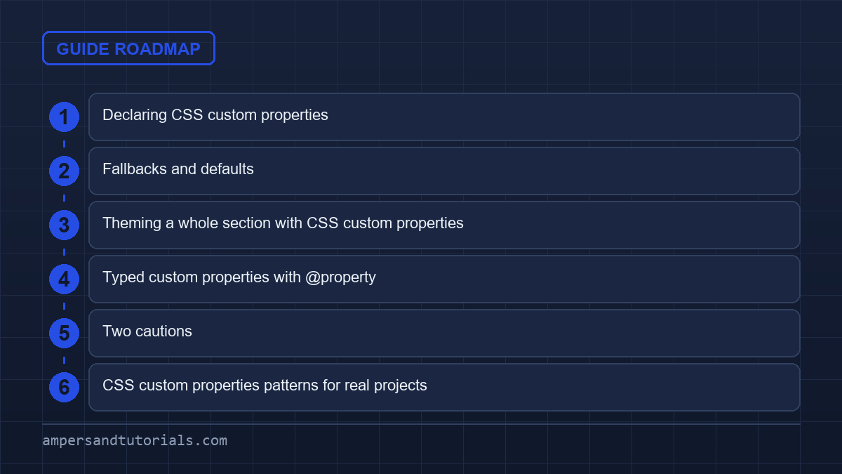
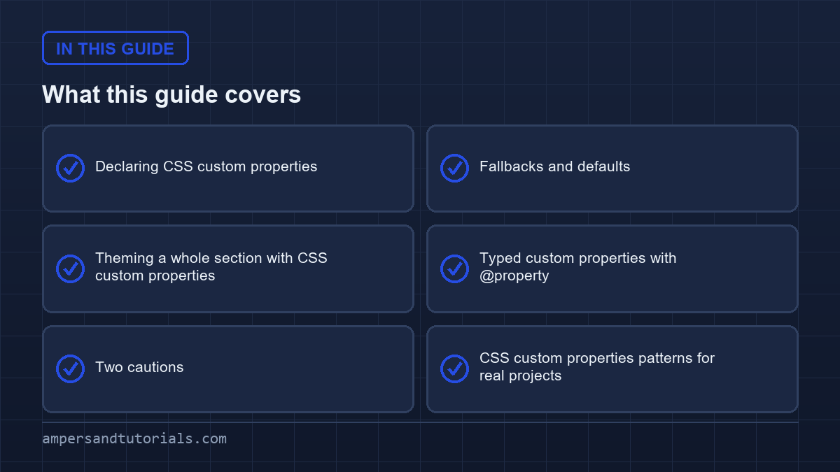
Declaring CSS custom properties
:root {
  --brand: #0f766e;
  --space: 1rem;
  --radius: 0.5rem;
}

.button {
  background: var(--brand);
  padding: var(--space);
  border-radius: var(--radius);
}
:root is the document element, so variables declared there are available everywhere. The value is a live runtime string: you can change --brand at any selector and every descendant that reads it updates, with no recompilation.
Fallbacks and defaults
var() accepts a fallback after a comma, used when the property is not defined or is an invalid value for the context.
.card {
  color: var(--text, #1e293b);           /* fallback to near-black */
  padding: var(--pad, var(--space, 1rem)); /* nested fallbacks */
}
A pattern worth learning: a component sets a default at its root, and a parent overrides it to customise just that instance. It is how component libraries expose theming without a separate API.
.badge { --badge-bg: #ccfbf1; --badge-fg: #0f766e;
         background: var(--badge-bg); color: var(--badge-fg); }

.badge.danger { --badge-bg: #fee2e2; --badge-fg: #991b1b; }
Theming a whole section with CSS custom properties
Because custom properties inherit, redefining them on a container themes everything inside without touching the components.
.promo { --brand: #b45309; }   /* everything in .promo uses amber now */

@media (prefers-color-scheme: dark) {
  :root { --brand: #5eead4; }
}
This is the cleanest way to support dark mode: keep the same rules and swap the variables. No duplicated stylesheets.
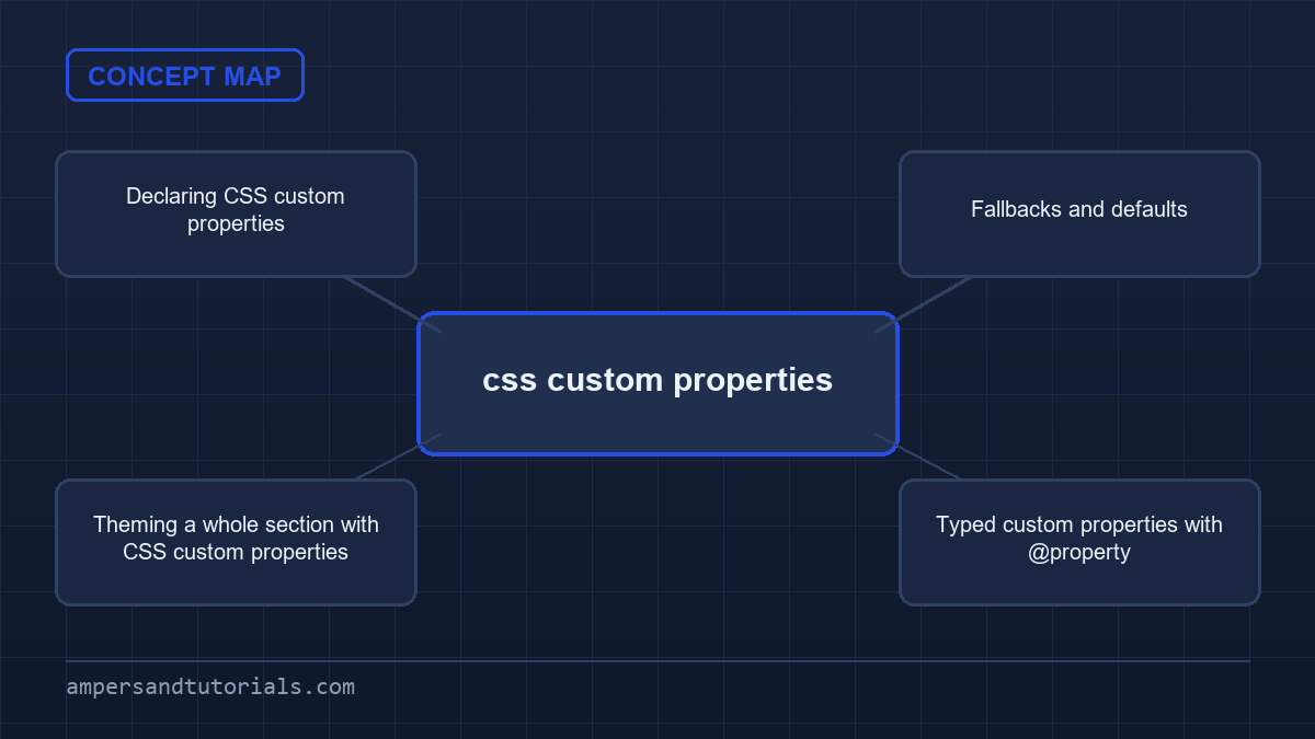
Typed custom properties with @property
By default a custom property is an untyped string, which means the browser cannot animate it or give it a starting value. @property registers a type, an initial value and whether it inherits.
@property --angle {
  syntax: "<angle>";
  initial-value: 0deg;
  inherits: false;
}

.spinner {
  background: conic-gradient(from var(--angle), teal, transparent);
  animation: spin 2s linear infinite;
}

@keyframes spin { to { --angle: 360deg; } }
Without @property that animation would jump instead of interpolating, because the browser would not know the value is an angle. With it, custom properties become first-class animatable values. The syntax string accepts types such as <color>, <length>, <percentage> and <angle>.
Two cautions
- They are not preprocessor variables. A Sass variable is replaced at build time; a custom property exists at runtime, cascades and can be changed by JavaScript with
element.style.setProperty('--x', value). - Do not over-abstract. A handful of tokens — colour, spacing, radius, font size — covers most projects. Hundreds of nested variables make a stylesheet harder to read than the values they replace.
Next: CSS nesting and cascade layers. To learn modern CSS with a mentor, Ampersand Academy teaches web development one-to-one.
CSS custom properties patterns for real projects
Name tokens by role, not by appearance. The difference between a maintainable set of CSS custom properties and a pile of variables shows up at the first rebrand: --blue-500 forces every reader to guess where it is used, while --accent says why it exists and where it belongs. Keep the palette small — a brand colour, a surface ramp, a text ramp, a border — and derive the in-between shades rather than declaring them, so a change at the root propagates through the whole system. Teams that adopt this pattern once find that component code stops mentioning colour altogether, and CSS custom properties become the boundary between design decisions and implementation detail.
Scope overrides deliberately instead of fighting specificity. Because CSS custom properties inherit, redefining one on a container themes everything inside it, which makes a section-level theme a single declaration: set the tokens on the section wrapper and every descendant picks them up without a single extra selector. The same mechanism gives you a dark theme by redefining a handful of tokens inside a media query, a high-contrast mode with an attribute selector, and per-component theming for a marketing band that must look different from the application around it. The rule that keeps this from becoming chaos is that overrides change tokens, never component rules, so the cascade stays boring and predictable.
Use fallbacks as documentation of intent. When a component declares var(--pad, 1rem), the fallback states the value the component is happy to live with when nobody overrides it, and it protects the layout if the token is renamed elsewhere. Fallbacks also let a component render sensibly before a stylesheet finishes loading, which matters for content above the fold. Where they stop helping is when the same fallback value is repeated in fifty places; at that point the default belongs in one rule on the component root, and the var() references should be bare. Consistency here is worth a short comment in the stylesheet, so the CSS custom properties convention survives staff turnover.
Reach for @property when a token must behave like a real value. Registering a custom property with a syntax and an initial value gives it a type, which means the browser can validate it, interpolate it in transitions and animations, and give the editor correct autocompletion. That turns a token from a raw string that happens to hold a colour into a first-class animatable property, which is exactly what you need for gradients that move smoothly or numbers that count up. The cost is a few lines of registration per token, so reserve @property for the tokens you actually animate or validate, and keep the rest as ordinary CSS custom properties declared where they are read.
Two cautions remain. First, CSS custom properties are not scoped by a build step: everything declared is visible at runtime to anyone who opens the inspector, so they are for theming and structure, never for secrets. Second, they fail silently — an undefined name resolves to the guaranteed invalid initial value rather than an error — so a typo in a token name produces an unset property instead of a build failure. Linting and a quick pass in the browser’s colour and layout inspectors catch both problems early. Handled with that care, CSS custom properties give a project a design layer that designers can read, that components consume without coupling, and that survives years of feature work.
Practical pitfalls with css custom properties
One common trap appears when developers assume that css custom properties set on a parent will never be overridden by a later rule in a child that does not explicitly reference it. Because inheritance happens after cascade, a child can mistakenly reset the value through a more specific selector, breaking layout without any warning. Detect this by auditing the cascade tree with the browser’s computed‑styles pane and by adding a fallback that mirrors the intended default, so a stray override reverts to a safe baseline.
Unexpected inheritance traps
When a component relies on css custom properties for spacing, a global reset that touches the same token can propagate down and cause spacing collapse in deeply nested elements. The fix is to scope the token at the component root, then use var(--my-token, 1rem) as a fallback that locks the component to its own design system. This pattern isolates the component from accidental global changes while preserving the ability to theme at higher levels.
Another subtle issue emerges with SVG elements: they do not inherit css custom properties from HTML ancestors unless the inherit keyword is used explicitly on the attribute. Therefore, an attempt to color an inline SVG with a variable defined on :root will silently fail, leaving the default fill. Workaround is to set fill: var(--svg-fill, currentColor) on the SVG path element or to reference the variable through style attribute on the SVG tag itself.
Performance‑related pitfalls also exist. Changing a css custom property on a high‑frequency element, such as a list item in a scrolling list, forces the browser to recompute styles for every descendant on each frame. If the property controls a layout‑triggering attribute like width or margin, the cost can become noticeable. Mitigate by restricting updates to variables that affect only paint‑only properties, like color or opacity, or by throttling the JavaScript that changes them.
Advanced edge cases for css custom properties
Composite values pose a challenge because var() only substitutes a raw string; the surrounding function must be able to parse the final token correctly. For instance, trying to build a box-shadow from separate color and offset css custom properties will fail if the offsets are not provided in the same declaration. The solution is to register a custom property with a syntax that matches the whole composite, such as syntax: ", then supply the full string at once.
Media‑query interactions create another edge case. css custom properties declared inside a media block are not available outside it, which can cause unexpected fallback resolution when the viewport changes. To avoid flash‑of‑incorrect‑style, define the variable at the root with a sensible default, then override inside the media query. This ensures the variable always has a defined value, and the transition between breakpoints is smooth.
Browser‑specific parsing quirks also affect how a variable’s value is treated. Some browsers treat unquoted url() values as invalid when the URL contains spaces, even if the final computed string is valid. Adding quotes around the URL inside the css custom property declaration normalizes behavior across browsers: --bg: url("images/bg image.png"). This small detail prevents layout shifts on browsers that would otherwise discard the rule.
Finally, consider the interaction with CSS Houdini Paint Worklets. A worklet can read a css custom property via the getComputedStyle() API, but the worklet runs on a separate thread and only receives the computed value at the time of registration. If the variable changes later, the painting does not automatically update, leading to stale graphics. To keep the worklet in sync, expose a custom property that the worklet watches via registerPaint() and trigger a repaint by toggling a dummy property.
Step‑by‑step workflow for theming a dynamic component
Start by identifying the visual tokens that the component will expose: primary colour, border radius, spacing unit. Declare those as css custom properties on the component’s host selector, for example .card { --card-bg: #fff; --card-radius: 0.5rem; }. Next, write the component’s internal rules using var(--card-bg) and var(--card-radius). Third, create a theming wrapper that redefines the same variables, like .theme‑dark { --card-bg: #1e1e1e; }, and place the component inside this wrapper. Fourth, if the theme can change at runtime, expose a JavaScript function that toggles the wrapper class on the root element, causing the component to recompute instantly.
When the component must animate a token, register the variable with @property before any animation definitions. For a progress bar that animates width, use @property --progress { syntax: ". Then animate via animation: progress 2s ease forwards where the keyframes update --progress. This approach guarantees smooth interpolation and prevents the animation from jumping.
Testing the workflow involves two steps: visual regression snapshot and runtime sanity check. Capture a screenshot of the component in both default and themed states, then run a script that toggles the theme class and asserts that the computed background-color matches the expected variable value. This guard catches accidental typo in variable names early in CI.
Real‑world example: dark‑mode toggle with JavaScript
The following snippet demonstrates a minimal dark‑mode switch that relies on css custom properties for colour tokens. The JavaScript toggles a class on document.documentElement, causing all components that use the colour variables to update automatically.
/* Base palette */
:root {
  --bg: #ffffff;
  --fg: #111111;
}

/* Dark palette overrides */
.dark {
  --bg: #111111;
  --fg: #eeeeee;
}

/* Component using variables */
.body {
  background: var(--bg);
  color: var(--fg);
}

/* Toggle logic */
document.getElementById('modeBtn').addEventListener('click', () => {
  document.documentElement.classList.toggle('dark');
});
/* Base palette */
:root {
--bg: #ffffff;
--fg: #111111;
}/* Dark palette overrides */
.dark {
--bg: #111111;
--fg: #eeeeee;
}/* Component using variables */
.body {
background: var(--bg);
color: var(--fg);
}/* Toggle logic */
document.getElementById('modeBtn').addEventListener('click', () => {
document.documentElement.classList.toggle('dark');
});
Because the variables are defined on the root, every descendant recomputes instantly without a page reload. The pattern scales: add more tokens for borders, shadows, or accent colours, and they inherit the same switch‑logic without additional JavaScript.
Decision guide: when to use @property versus plain css custom properties
Use plain css custom properties for static design tokens that never animate and whose values are simple strings, numbers, or colours. This keeps the stylesheet lightweight and avoids the extra parsing step that browsers perform for each @property registration. Reserve @property for cases where the token participates in a transition, animation, or interpolation, such as rotating elements, progress bars, or gradient stops. Registering a property incurs a one‑time cost at stylesheet load, but the runtime benefits of smooth animation outweigh that cost for interactive UI elements.
A practical rule of thumb: count the number of animated components that would need the token. If fewer than three, consider using keyframe‑level animation of explicit values instead of a variable. If the token is shared across many components, registering it once centralises the type definition and prevents divergent syntax errors.
Lastly, factor in browser support. All modern browsers implement @property, but older versions of Safari require a prefix and have known bugs with initial-value. When supporting legacy browsers, fall back to plain css custom properties and use JavaScript‑driven animation libraries that can interpolate strings, accepting a slight performance trade‑off.
Frequently asked questions
What is a CSS custom property?
A variable written with a double dash, such as –brand, and read with var(–brand). It cascades and inherits at runtime, unlike a preprocessor variable that is replaced at build time.
Do CSS variables work in all browsers?
Yes. Custom properties and the var function are widely supported in every current browser, so they are safe to use in production.
How do I animate a CSS variable?
Register it with @property, giving it a syntax such as angle, colour or length and an initial value. Then the browser can interpolate it and you can animate it in keyframes.
What is the difference between –x and var(–x, fallback)?
–x declares the variable. var(–x, fallback) reads it and uses the fallback value when the variable is undefined or invalid in that context.
How do I support dark mode with custom properties?
Declare your colour tokens at :root, then redefine them inside a prefers-color-scheme dark media query. The same rules apply and every component picks up the new values.
Last updated on · Written by Dinesh Kumar R