


Quick answer: A mega menu in Materialize CSS is built by hand because the framework has no native component. You put a multi column panel inside a dropdown-trigger item, style it with a wide content grid that drops down on hover, and use the Materialize grid columns so sub links stay neatly organised under a large panel.
Learn Mega menu for Materialize CSS Framework and implement where it requires a huge menu
This tutorial briefs how to add a Mega menu in Materializecss.com. As we know, there is no default option in Materializecss Framework for Megamenu, we take the privilege in demonstrating how to add a mega menu using simple CSS classes.
What is available in MaterializeCSS.com?
MaterializeCSS in default provides navbar components with several variants such as Logo with Right Aligned Links, Logo with Left Aligned Links, Center Logo Option, Fixed Navbar, Navbar with Tabs, Navbar with Dropdown Menu and Search Bar. However, there is no default option to create Megamenu in MaterializeCSS. In the following, we shall discuss how a standard Navbar can be inserted and how to create a Mega menu in the Navbar.
Steps to Create Standard Navbar with a drop-down menu:
1. Download the starter pack of MaterializeCSS Framework from the following link:
http://materializecss.com/getting-started.html
2. Extract to a folder.

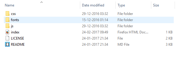
3. Create index.html in the same folder using the HTML Setup given in the above-mentioned link.

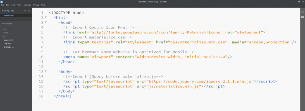
- Now that the index file has been set up, add the Navbar with Dropdown Component from the following link:
http://materializecss.com/navbar.html
In the above link copy Navbar Dropdown Menu Script and paste it in the body of the index.html

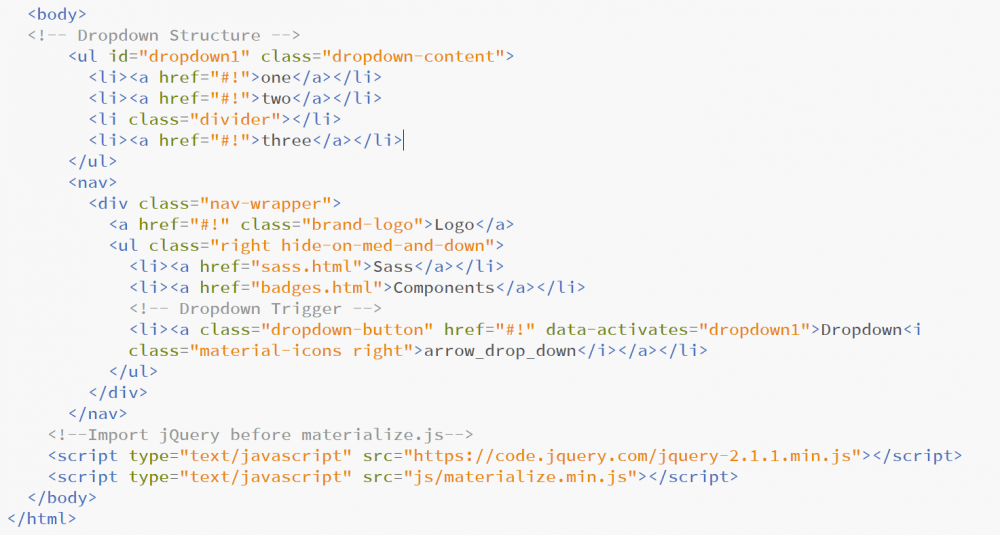
5. In order to activate the drop-down functionality add the following JavaScript just before tag and within the $( document ).ready(function) block as given below:
<script>
$( document ).ready(function(){
$(".dropdown-button").dropdown();
})
</script> 
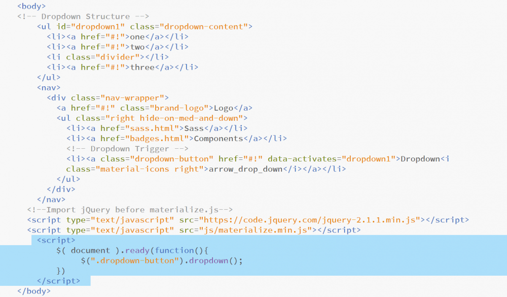
6. Now a standard navbar with a drop-down menu is created and you will be getting a result as given below.


Steps to Mega Menu from the Standard Navbar with drop-down Menu:
1. Once we have the Navbar with a drop-down menu, we can convert the drop-down menu into a mega menu. In the index.html, you will now find a <ul> element with id=”dropdown1″. Modifications have to be done in this <ul> in order to achieve mega menu.
2. First, add a class name “mega” next to the “dropdown-content”.

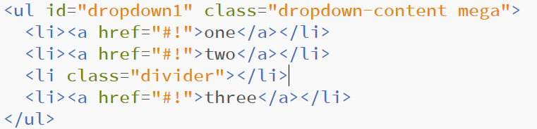
- Now write CSS property for the .mega class. In order to increase the width of the dropdown, add min-width CSS property in the mega class as below.
Note:
You can set the min-width value as per your requirement. Here, min-width is set to 610 px.
<style>
.mega {
min-width: 610px !important;
}
</style>
The style script has to declared just before the </head> tag

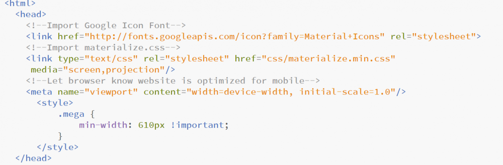
4. Now you can see that the width of the drop-down menu has increased. Now we can add columns and rows and create the mega menu. In order to add column and rows, the respective script has to be included within the
tag with “dropdown-content” class.


- Here, we have intended to create a Mega menu with three column with respective headers.
In order to achieve the above, first, we will be creating a ROW inside the <ul> tag
<ul id="dropdown1" class="dropdown-content mega">
<div class="row">
</div>
</ul>
Second, we will be splitting the row into three columns
<ul id="dropdown1" class="dropdown-content mega">
<div class="row">
<div class="col m4">
<li><a href="#!">one</a></li>
<li><a href="#!">two</a></li>
<li class="divider"></li>
<li><a href="#!">three</a></li>
</div>
<div class="col m4">
<li><a href="#!">one</a></li>
<li><a href="#!">two</a></li>
<li class="divider"></li>
<li><a href="#!">three</a></li>
</div>
<div class="col m4">
<li><a href="#!">one</a></li>
<li><a href="#!">two</a></li>
<li class="divider"></li>
<li><a href="#!">three</a></li>
</div>
</div>
</ul>
Third, now we can add the headers to respective columns
<ul id="dropdown1" class="dropdown-content mega">
<div class="row">
<div class="col m4">
<li>Head 1</li>
<li><a href="#!">one</a></li>
<li><a href="#!">two</a></li>
<li class="divider"></li>
<li><a href="#!">three</a></li>
</div>
<div class="col m4">
<li>Head 2</li>
<li><a href="#!">one</a></li>
<li><a href="#!">two</a></li>
<li class="divider"></li>
<li><a href="#!">three</a></li>
</div>
<div class="col m4">
<li>Head 3</li>
<li><a href="#!">one</a></li>
<li><a href="#!">two</a></li>
<li class="divider"></li>
<li><a href="#!">three</a></li>
</div>
</div>
</ul>

Additional Notes:
What is Megamenu?
Megamenu is one of the recent advancements of a drop-down menu. It is nothing but a drop-down menu where a website developer can group individual menu items under categories. For example, consider an apparel e-commerce website where one will have a general shop button under which you can have group categories for Men’s Apparel Section, Women’s Apparel Section, Kid’s Apparel Section and under each Category Section there will individual items such as Shirts, Trousers, Jeans, etc.
Learn about adding logo to navbar in Materialize CSS
Frequently asked questions
Does Materialize CSS include a built-in mega menu?
No. Mega menus are custom builds in Materialize, usually a wide multi column panel styled with the grid inside a dropdown-trigger element.
How do I keep a mega menu open while the mouse moves to a link?
Trigger the panel on hover on both the trigger and the panel itself, using a small jQuery hover handler rather than a click toggle.
Will a Materialize mega menu work on mobile screens?
A wide panel does not fit small screens. Collapse it into a simple accordion list on mobile, or let it scroll horizontally.