
Learn about Materialize CSS Simple Raised Button Customization.
Introduction:
Buttons are one of the most widely used elements in any of the HTML Frameworks. No wonder it is going to be different in Materialize CSS Framework. There are several types of buttons that are present in Materialize CSS Framework which includes Simple Button, Simply Raised Button, Flat Buttons, Floating Button, Fab Buttons, Disabled Buttons and much more. This tutorial will be brief about customizing a simple raised button and changing its style according to the need.
Simple Button
In Materialize CSS it is easy to create a button. By simply adding “btn” class in <a> will produce a simple raised button with teal colour. Teal is the default colour that Materialize CSS Framework produces when no colour is specified.
<a href="#" class="btn">Test</a>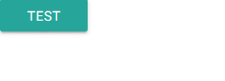
Changing Color in Simple Button
It is easy to change the colour of buttons in Materialize CSS Framework. By simply adding the colour name as prescribed in the Materialize CSS Framework Color Palette with the class will produce preferred colours.
Link for Color Palette:
http://materializecss.com/color.html
Now in order to change the default Teal colour of the button to Dark, Red, we can add the class red darken-4 class inside the Class. This will produce a Simple Raised button with a Dark Red colour.
<a href="#" class="btn red darken-4">Test</a>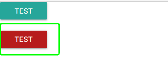
We can either darken the main colour by adding darken class next to the prime colour. Materialize CSS give 4 variations for darkening as well as for lightening and accent shades. You can play around and produce several colour variations according to the need.
We can also apply a new colour that is not present in the Materialize CSS using CSS properties. For example, if I wish to add orange colour with hex code: #FF6347, the following method will help in adding custom colour to the button.
<a href="#" class="btn" style="background-color: #FF6347">Test</a>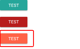
In the above Orange Button, if you wish to change the text colour to Black, the coding is as follows:
<a href="#" class="btn" style="background-color: #FF6347; color:black">Test</a>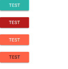
Changing Button Size
There is a default option in Materialize CSS Framework to increase the size of the button. By simply adding btn-large class next to btn class will increase the size of the button.
<a href="#" class="btn btn-large">Test</a> 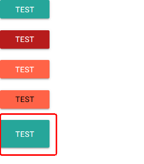
Disabled Button
Materialize CSS provides an easy option to add a button disable property to a button. Simply adding a disabled class next to the btn class will create a Disabled Button.
<a href="#" class="btn disabled">Test</a>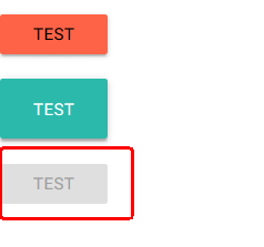
Waves Effect
Wave is an external library that produces an ink ripple effect in button components. Materialize CSS provides a waves effect to buttons. The waves effect can be added to any button by simply adding the class waves-effect next to the btn class. This produces an ink ripple effect when a button is clicked. Furthermore, waves have several options which can be implemented in buttons. Let’s discuss everything in detail.
Simple Waves Effect
Waves-effect creates an ink wave effect in a button. The colour of the waves will be similar to that of the button colour.
<a href="#" class="btn waves-effect">Test</a>Waves Light
Waves-light class, when applied along with the Waves-effect, will produce ink waves in white colour. These effects can be utilized in various scenarios where the white tint is required.
Waves Color
In Materialize CSS, there are several predefined waves colour that can be utilized in the button. Materialize CSS offers various Wave Colors such as White, Red, Yellow, Orange, Purple, Green, and Teal. These predefined waves colour can be directly called by adding respective classes such as waves-red, waves-green, etc.
<a href="#" class="btn waves-effect waves-red">Test</a>Colour of the waves can be customized by creating new classes, for example, if you require brown waves effect you can use the following CSS
.waves-effect.waves-brown .waves-ripple {‘
 background-color: rgba(121, 85, 72, 0.65);
}
<a href="#" class="btn white black-text waves-effect waves-brown">Test</a>Button with Icons
Materialize CSS provides an easy way to integrate icons into Buttons. In order to add icons to buttons, we need to add Google Material Icons CDN to the Website. After adding CDN, it is easy to call the icon in a button. We can change the icon as per our requirement by cross-referencing with the Google Material Icon list. The following coding will explain how icons are added to the button.
<a class="waves-effect waves-light btn"><i class="material-icons left">cloud</i>button</a>You can also check the Materialize Card Animation Tutorial.