



Quick answer: An input field that disappears in an Angular Material dark theme is usually caused by label or border colours that were hard coded, so they blend into the dark background. The fix is using theme aware tokens or mat form field styles instead of fixed colours, so the field adapts automatically.
Learn how to Bug fix for input field not visible in angular material dark themes
Angular Material is one of the most favoured User Interfaces for Angular Web Application development. Angular Material is known for its easy binding with Angular Code and web applications built using Angular alongside Angular Material performs better when compared to other UI frameworks.
Although Angular Material has good performance, it is still known for its bugs and glitches when it comes to the user interface. Recently, the current version of Angular Material has this glitch in the coding especially when users incorporate the darker theme especially, the pink-bluegrey.css theme. The main glitch which is noted is that, when a mat-input is incorporated, the field border and the text cursor is not visible. When we look into it, we find that it’s not a bug but a glitch that has to be fixed manually. This can be fixed by simply adding a dark background colour to the division or container which holds the mat input field.
In order to insert the input field, import MatImportModule in app.module.ts first. Later from the documentation site of Angular Material copy and paste the example mat form field. Be cautious to copy-paste the HTML, CSS elements in the respective component.
@import "~@angular/material/prebuilt-themes/indigo-pink.css";
<form class="example-form">
  <mat-form-field class="example-full-width">
    <input matInput placeholder="Favorite food" value="Sushi">
  </mat-form-field>

  <mat-form-field class="example-full-width">
    <textarea matInput placeholder="Leave a comment"></textarea>
  </mat-form-field>
</form>
<form class="example-form">
<mat-form-field class="example-full-width">
<input matInput placeholder="Favorite food" value="Sushi">
</mat-form-field>
<mat-form-field class="example-full-width">
<textarea matInput placeholder="Leave a comment"></textarea>
</mat-form-field>
</form>
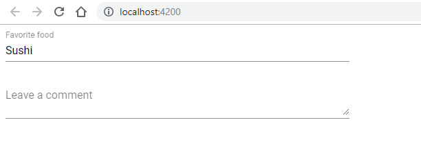
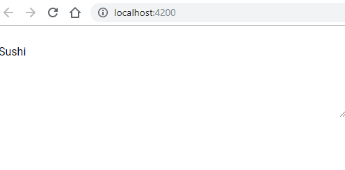
By default the theme is indigo-pink and without any glitch, the browser will render the output and form fields will be visible. Now, when you change the theme to pink-bluegrey.css or purple-green.css the form input will not be visible. The following screenshot shows how it is affected.
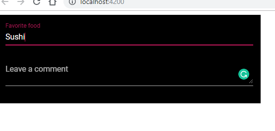
In order to fix this glitch, we can simply add the background colour to the form tag which contains the form input. The following coding and screenshot will show the rectified output. In the example-form CSS, add the last three classes to get the desired visible form field output.

.example-form {
    min-width: 150px;
    max-width: 500px;
    width: 100%;
    background-color: black;
    color: white;
    padding: 15px
  }
Get full Source Code of MatInput Fix for Dark Theme from Github
https://github.com/rdineshkumar88/angular-material/tree/master/MatInput-Dark-Theme-Glitch-Fix
Now that you have learnt Bug fix for input field not visible in angular material dark themes. You can also check our tutorial on Scrollable Angule Table. Check our Angular with Angular Material Training from Ampersand Academy
Frequently asked questions
Why is my input field invisible in a dark theme?
Hard coded colour values for the label, hint, or border clash with the dark background, so the text blends into the background colour.
How do I fix invisible input fields in dark mode?
Use theme aware tokens and mat form field styles instead of fixed colours, so the field adapts when the dark theme is applied.
Do Angular Material themes fix this automatically?
They do for built in components, so any remaining problem is usually caused by your own hard coded CSS on the input or its label.