
Learn How to open SideNav on the right in Materialize CSS
Mobile responsive navigation is one of the important aspects of a responsive website. It is possible to create beautiful main navigation for desktop/laptop browsers, however, when we design mobile navigation it is a must to make it easily accessible from all mobiles and tablets. There should be a mobile responsive button trigger and when a user clicks it, it should open up a mobile navigation. Follow this link to access the documentation for Sidenav in Materialize CSS.
There are two options when we create a mobile responsive navigation trigger and navigation panel. Either you can have it on the left or on the right. It is possible to create a mobile trigger button on the left and navigation panel, however, some users find the navigation button and panel on the left not that user-friendly. Materialize CSS offers a mobile responsive panel and trigger button on the left. The developers always look forward to having an easy hack to make the mobile responsive menu trigger and panel to the right.
This tutorial helps developers to implement a mobile responsive menu trigger and panel on the right. First, it is a must to incorporate the navigation bar in the website. Materialize CSS offers several variants of the navbar. Know how to create NavBar from this link
The first step you must do is to copy the Mobile Collapsible Navbar from the website along with the JavaScript. The JavaScript code has to be mentioned inside the script tag just above the body close tag.
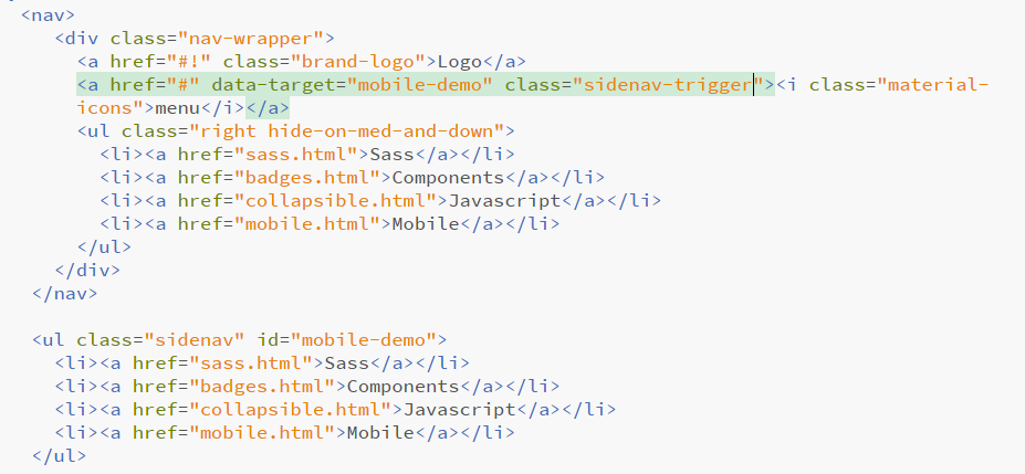
This will produce a Navbar with collapsible button and navigation pane on the left
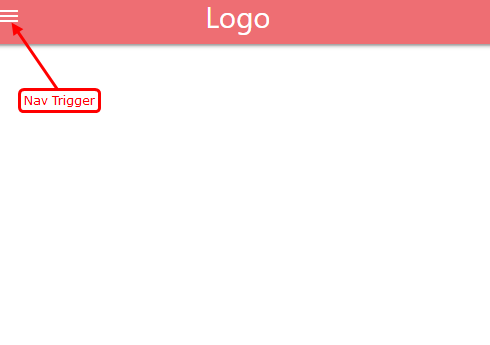
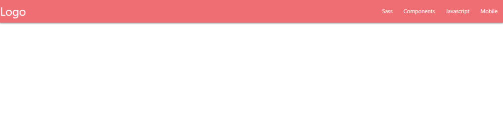
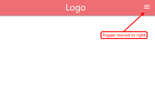
If you would like to have the Mobile Menu Trigger button on the right, just add the class “right” next to “sidenav-trigger” class in the mobile menu trigger HTML code.
<nav>
            <div class="nav-wrapper">
              <a href="#!" class="brand-logo">Logo</a>
              <a href="#" data-target="mobile-demo" class="sidenav-trigger right"><i class="material-icons">menu</i></a>
              <ul class="right hide-on-med-and-down">
                <li><a href="sass.html">Sass</a></li>
                <li><a href="badges.html">Components</a></li>
                <li><a href="collapsible.html">Javascript</a></li>
                <li><a href="mobile.html">Mobile</a></li>
              </ul>
            </div>
          </nav>

          <ul class="sidenav" id="mobile-demo">
            <li><a href="sass.html">Sass</a></li>
            <li><a href="badges.html">Components</a></li>
            <li><a href="collapsible.html">Javascript</a></li>
            <li><a href="mobile.html">Mobile</a></li>
          </ul>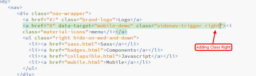
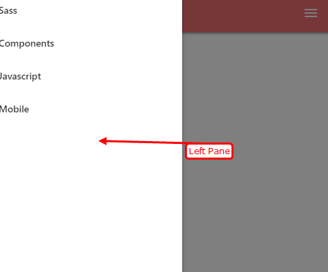
This is will render the mobile collapsible menu on the right and when the user clicks the navigation pane will open on the left side.
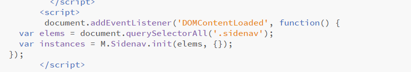
If you would like to bring the mobile navigation pane on the right side, add the key-value pair edge:’right’ in the Javascript. The code for which is mentioned below
 <script>
         document.addEventListener('DOMContentLoaded', function() {
    var elems = document.querySelectorAll('.sidenav');
    var instances = M.Sidenav.init(elems, {edge:'right'});
  });
</script>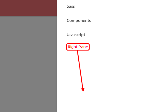
This will render the mobile navigation pane on the right. In the next tutorial, you will learn how to create accordion-type side navigation items. Now that we have seen how to open SideNav on the right in Materialize CSS, Learn about Colors in Materialize CSS.