


Quick answer: Responsive CSS Grid in Angular Material lets your layout adapt to any screen size using a named grid, where you define rows and columns and place content into them. Instead of fixed widths, you set flexible tracks and let items flow, so one template works on a phone, a tablet, and a desktop.
Learn Responsive CSS Grid in Angular Material
n this tutorial, you will learn how to incorporate simple responsive CSS Grid Layout using a framework called Materialize CSS in Angular Material.
We write this tutorial, with the understanding that you have created an Angular Project and Angular Material version 6.2.1. If you are new to Angular and Angular Material, you must first learn about creating an Angular project and installing Angular Material in the same project. Currently, there is no proper grid layout in Angular Material. FlexLayout is one way to achieve Grid Layout. Here, we will discuss how to create a Grid Layout using Materialize CSS.
We have forked the CSS components such as Grid, Helpers, Typography from the Materialize CSS website. You can download the forked file at the link given below. In order to learn how the Materialize CSS Grid functions, follow this link: Materialize CSS Framework.
Once you have downloaded the forked Materialize CSS file, you will have to paste it into your src folder of Angular Project. The next step is to import the downloaded Materialize CSS forked file in the global stylesheet – style.css.

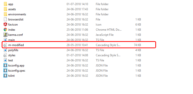
The code for doing it is:
@import "m-modified.css";

Once you have included the above code in your style.css, you are all set to utilize the grid structure of Materialize CSS framework.
Walkthrough of how grid in Materialize CSS grid works:
The grid system in Materialize CSS framework works via rows and columns. For creating a row in Materialize CSS, you must create a division with a row as a class.
<div class=”row”></div>The above code will create a row. Ideally, a single row will have 12 columns. Now, to create 2 columns in large and medium-size devices, use the following code:
<div class=”row”>
<div class=”col m6”> </div>
<div class=”col m6”> </div>
</div>
To make each column occupy entire row in small devices, use the following code
<div class=”row”>
<div class=”col m6 s12”> </div>
<div class=”col m6 s12”> </div>
</div>
To create three columns of equal width and occupying the entire row and all these columns to occupying entire row in small screens, use the following code:
<div class=”row”>
<div class=”col m4 s12”> </div>
<div class=”col m4 s12”> </div>
<div class=”col m4 s12”> </div>
</div>
You can also understand how the grid system works from Materialize CSS website. Once you have created columns according to your requirement, you can include all the necessary components such as forms, buttons, cards, lists inside each division.
<div class="row">
   <div class="col m4 s12">
      <h3>Column 1</h3>
   </div>
   <div class="col m4 s12">
      <h3>Column 2</h3>
   </div>
   <div class="col m4 s12">
      <h3>Column 3</h3>
   </div>
</div>

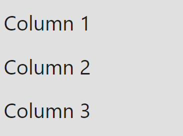
Once you have completely understood the grid structure, you can play around and create responsive grid layouts in Angular Material. Now that you have learnt how to implement Responsive CSS Grid in Angular Material, You can also learn about Scrollable Table in Angular Material.
Frequently asked questions
What is a responsive grid in Angular Material?
It is a grid based layout where rows and columns are defined by name, so components can be placed and rearranged easily at any screen size.
How do I change the layout on smaller screens?
Use the breakpoint observer or media query to detect the screen, then update the number of columns and areas for small screens.
Does the grid layout work with the breakpoint observer?
Yes, observing breakpoint state lets you compute column and row span values that change when the screen width changes.