
Quick answer: A mobile accordion menu in Materialize CSS is built by nesting a collapsible section inside each parent list item of the sidenav. Tapping a parent label expands its children while the parent itself still links to its own page, using the collapsible classes plus a collapsible-body div.
Learn Mobile menu with accordion type sub menu items
Materialize CSS is one of the most easy-to-use CSS frameworks for website development. Materialize CSS offers easy to use CSS and JS scripts to enable mobile responsive side navigation. In the previous tutorial, we have discussed how to add responsive mobile side navigation both on the left and right side. If you want to learn how to create mobile responsive side navigation follow the link.
In this tutorial, you will learn how to create accordion-like submenu items on the side navigation. For this, first, we have to create a side navigation menu. Suppose, if there is the main level menu and sub-level menu. For example, take an e-commerce website you have Men and Women Dresses. Under the Men’s section, you will have Trousers, Shirts, Shoes, etc. On the same line, the Women’s section will have Skirts, Trousers, Tops, etc. In order to have a layout that depicts this level, the following things have to be done. Open the collapsible section in materialize CSS website and copy the HTML and JS for accordion and paste in the list item of side nav.
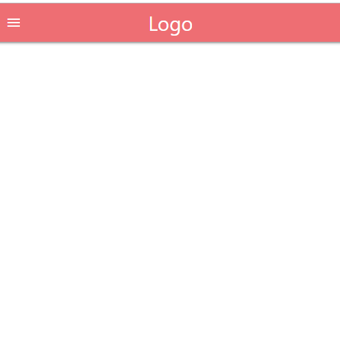
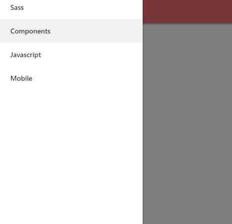
The HTML code has to be copy-pasted inside li tag of side navigation. The javascript has to be included inside the script tag where we already have a script for side navigation.
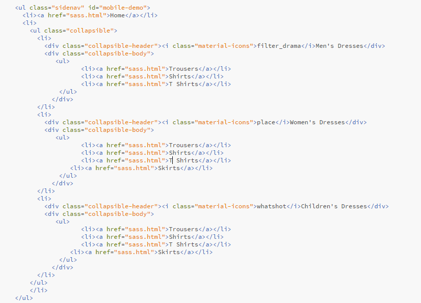

Once you have added the script, you can now rename the Accordion Header and add the list item inside collapsible body check as required.
In our case, we have created 3 headers Men’s Dresses, Women’s Dresses and Children’s Dresses and each header have their respective sub-items such as Trousers, Shirts, T-Shirts, Shoes, Skirts, etc.
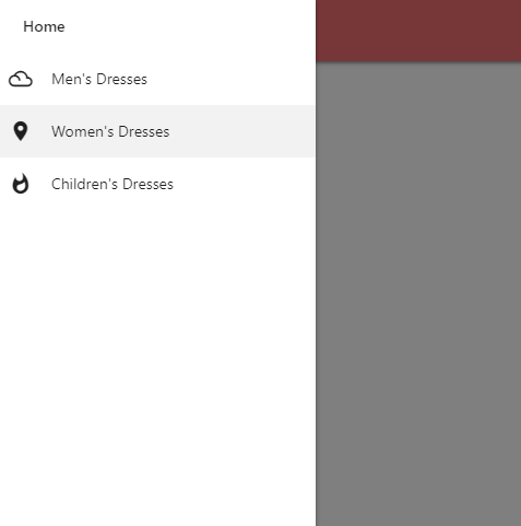
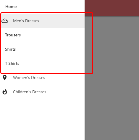
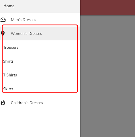
We can also explore having Collapsible type menu level instead of Accordion type based on the requirement. It can be achieved by simply calling the key value accordion: false in the javascript. This will create sub-menu with collapsible type instead of Accordion Type.
Learn about Opening Side Nav on Right Side in Materialize CSS. For more details about various courses, check out Ampersand Academy.
Frequently asked questions
How do I make Materialize sidenav sub menus expand on tap?
Wrap the parent item in the collapsible classes and place the nested list inside a collapsible-body div. The parent itself stays a normal link.
Can only one sub menu stay open at a time?
Not by default. Pass the accordion option to the collapsible component to close other open sections when a new one opens.
Does an accordion sub menu work on desktop side navigation too?
Yes. Collapsible sections respond to clicks on any screen, so the same markup serves desktop and mobile side navigation.